---
title: Images
description: Handle image input, integrate custom media pickers, and configure image block properties.
---
# Images
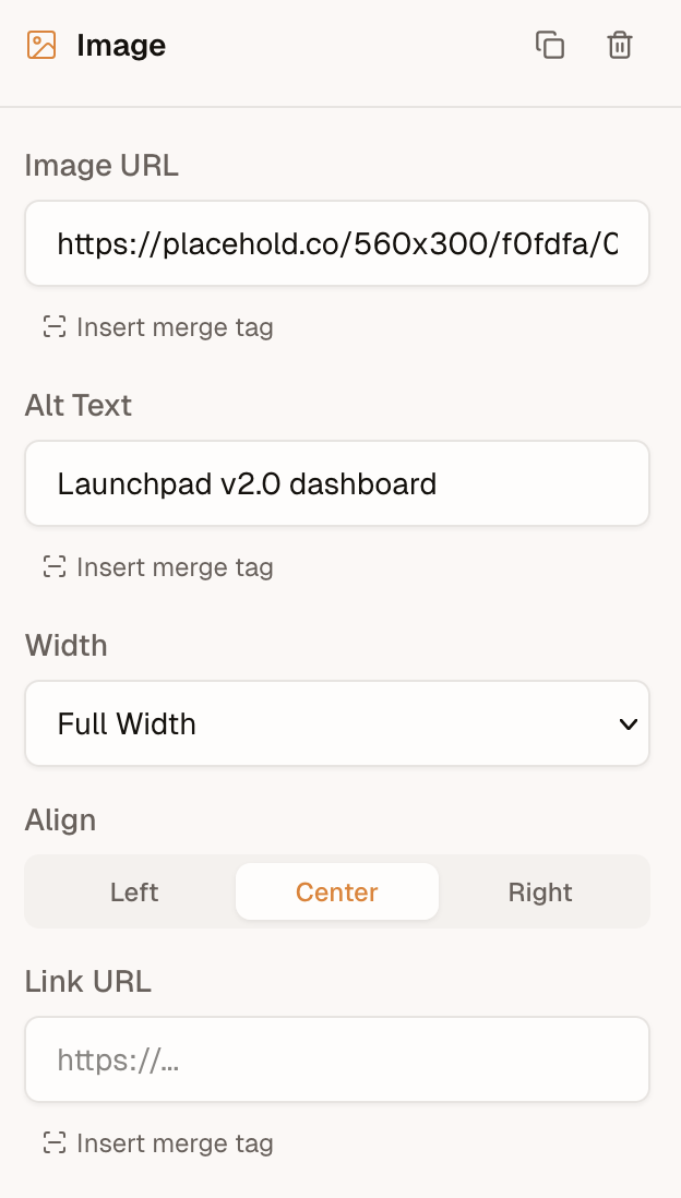
When a user adds an image block, the editor shows a text field where they can paste an image URL. The image block toolbar exposes fields for `src`, `alt`, `width`, `align`, and an optional `linkUrl`.
 ## Browse and pick {#browse-and-pick}
A browse button appears alongside the URL input when **either** a [`media`](/backend/media) provider **or** `onRequestMedia` is configured.
## Browse and pick {#browse-and-pick}
A browse button appears alongside the URL input when **either** a [`media`](/backend/media) provider **or** `onRequestMedia` is configured.
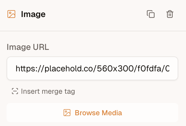 `media` opens the built-in library modal. `onRequestMedia` is a **UI override** (Bynder, Cloudinary widget, a host modal): the editor calls it instead of opening the library, and it wins when both are set. Return a `MediaResult`, or `null` if the user cancels. When `alt` is provided, the editor fills in the image's alt text.
```ts
import { init } from '@templatical/editor';
const editor = await init({
container: '#editor',
async onRequestMedia() {
// Open your own modal, file browser, or asset manager
const image = await openMyMediaModal();
if (!image) return null;
return { url: image.url, alt: image.alt };
},
});
```
A gallery of your own is the `media` key — see [Media](/backend/media).
[Open in playground](https://play.templatical.com/scenes/media-on-request)
The type signature:
```ts
interface MediaResult {
url: string;
alt?: string;
/** The file's size in px, when known. Feeds the image's aspect-ratio lock. */
width?: number;
height?: number;
}
interface MediaRequestContext {
/** Media categories the editor is asking for (e.g. `['images']`). */
accept?: MediaCategory[];
/**
* Files dragged directly onto an image block or field. Present only for
* drag-and-drop requests; absent when the user clicks "Browse Media".
*/
files?: File[];
}
type OnRequestMedia = (context?: MediaRequestContext) => Promise;
```
## Drag and drop to upload
Users can drag an image file from their computer straight onto an image block (empty or filled), the sidebar image field, or a custom block's image field.
With `onRequestMedia`, the editor calls that handler with the dropped file in `context.files`:
```ts
const editor = await init({
container: '#editor',
async onRequestMedia(context) {
// A file was dropped — upload it and return its hosted URL.
if (context?.files?.length) {
const url = await uploadToMyBackend(context.files[0]);
return { url };
}
// No file — the user clicked "Browse Media". Open your picker.
const image = await openMyMediaModal();
return image ? { url: image.url, alt: image.alt } : null;
},
});
```
With a `media` provider and no callback, drop goes to `provider.create({ file, templateId? })` when `create` is a function. `create: false` hides the drop affordance: the library is still browsable.
A few notes:
- **One file per drop.** `files` is an array for forward-compatibility, but the editor currently sends a single file (`files[0]`).
- **Images only.** The editor pre-filters dropped files to image MIME types before calling you.
- **No picker, no drop.** Without `onRequestMedia` and without a `media` provider whose `create` is a function, the drop affordance doesn't appear and drops are ignored.
- **Don't return a `blob:` URL.** `URL.createObjectURL(file)` is session-local and breaks export. Upload the file and return a durable URL (or a `data:` URL).
With a `media` provider whose `create` is a function, dropped files upload through that provider — no `onRequestMedia` needed. A custom handler still takes precedence.
## Display-only URL resolution
Some integrations store canonical image references that aren't directly displayable — for example, an offline-capable app whose templates reference images by plain file name (`logo.png`), displayable only via ephemeral `blob:` URLs created from local storage. `onRequestMedia` covers the media-browser path, but when a user types or pastes such a value into the `src` input, the canvas has nothing to show.
The `resolveImageUrl` callback closes that gap. It maps a src value to a **preview URL for the canvas only** — the content model keeps the canonical value, and `toMjml()` exports it untouched:
```ts
const editor = await init({
container: '#editor',
async resolveImageUrl(src) {
const file = await myFileStore.lookup(src);
return file ? URL.createObjectURL(file) : null;
},
});
```
The type signature:
```ts
resolveImageUrl?: (src: string) => string | null | Promise;
```
Return the preview URL, or `null` (or the input value) to use the src as-is.
How the editor calls it:
- **Once per committed value.** Typing in the src input is debounced, so partial values (`lo`, `logo.p`, …) never reach your resolver.
- **Cached per src** for the editor instance's lifetime — the same src in several blocks resolves once.
- **Failures fall back gracefully.** A thrown error or rejected promise is cached as "use as-is"; the editor won't retry the same src. Note this also holds for *transient* failures: a src that failed to resolve stays unresolved until the editor is re-initialized. A hook to re-trigger resolution may be added in a future release.
- **Merge-tag srcs are skipped.** A src like
`media` opens the built-in library modal. `onRequestMedia` is a **UI override** (Bynder, Cloudinary widget, a host modal): the editor calls it instead of opening the library, and it wins when both are set. Return a `MediaResult`, or `null` if the user cancels. When `alt` is provided, the editor fills in the image's alt text.
```ts
import { init } from '@templatical/editor';
const editor = await init({
container: '#editor',
async onRequestMedia() {
// Open your own modal, file browser, or asset manager
const image = await openMyMediaModal();
if (!image) return null;
return { url: image.url, alt: image.alt };
},
});
```
A gallery of your own is the `media` key — see [Media](/backend/media).
[Open in playground](https://play.templatical.com/scenes/media-on-request)
The type signature:
```ts
interface MediaResult {
url: string;
alt?: string;
/** The file's size in px, when known. Feeds the image's aspect-ratio lock. */
width?: number;
height?: number;
}
interface MediaRequestContext {
/** Media categories the editor is asking for (e.g. `['images']`). */
accept?: MediaCategory[];
/**
* Files dragged directly onto an image block or field. Present only for
* drag-and-drop requests; absent when the user clicks "Browse Media".
*/
files?: File[];
}
type OnRequestMedia = (context?: MediaRequestContext) => Promise;
```
## Drag and drop to upload
Users can drag an image file from their computer straight onto an image block (empty or filled), the sidebar image field, or a custom block's image field.
With `onRequestMedia`, the editor calls that handler with the dropped file in `context.files`:
```ts
const editor = await init({
container: '#editor',
async onRequestMedia(context) {
// A file was dropped — upload it and return its hosted URL.
if (context?.files?.length) {
const url = await uploadToMyBackend(context.files[0]);
return { url };
}
// No file — the user clicked "Browse Media". Open your picker.
const image = await openMyMediaModal();
return image ? { url: image.url, alt: image.alt } : null;
},
});
```
With a `media` provider and no callback, drop goes to `provider.create({ file, templateId? })` when `create` is a function. `create: false` hides the drop affordance: the library is still browsable.
A few notes:
- **One file per drop.** `files` is an array for forward-compatibility, but the editor currently sends a single file (`files[0]`).
- **Images only.** The editor pre-filters dropped files to image MIME types before calling you.
- **No picker, no drop.** Without `onRequestMedia` and without a `media` provider whose `create` is a function, the drop affordance doesn't appear and drops are ignored.
- **Don't return a `blob:` URL.** `URL.createObjectURL(file)` is session-local and breaks export. Upload the file and return a durable URL (or a `data:` URL).
With a `media` provider whose `create` is a function, dropped files upload through that provider — no `onRequestMedia` needed. A custom handler still takes precedence.
## Display-only URL resolution
Some integrations store canonical image references that aren't directly displayable — for example, an offline-capable app whose templates reference images by plain file name (`logo.png`), displayable only via ephemeral `blob:` URLs created from local storage. `onRequestMedia` covers the media-browser path, but when a user types or pastes such a value into the `src` input, the canvas has nothing to show.
The `resolveImageUrl` callback closes that gap. It maps a src value to a **preview URL for the canvas only** — the content model keeps the canonical value, and `toMjml()` exports it untouched:
```ts
const editor = await init({
container: '#editor',
async resolveImageUrl(src) {
const file = await myFileStore.lookup(src);
return file ? URL.createObjectURL(file) : null;
},
});
```
The type signature:
```ts
resolveImageUrl?: (src: string) => string | null | Promise;
```
Return the preview URL, or `null` (or the input value) to use the src as-is.
How the editor calls it:
- **Once per committed value.** Typing in the src input is debounced, so partial values (`lo`, `logo.p`, …) never reach your resolver.
- **Cached per src** for the editor instance's lifetime — the same src in several blocks resolves once.
- **Failures fall back gracefully.** A thrown error or rejected promise is cached as "use as-is"; the editor won't retry the same src. Note this also holds for *transient* failures: a src that failed to resolve stays unresolved until the editor is re-initialized. A hook to re-trigger resolution may be added in a future release.
- **Merge-tag srcs are skipped.** A src like {{product.image}} is never passed to the resolver; its `placeholderUrl` (if set) is resolved instead.
- **Video thumbnails are covered too.** An explicit video `thumbnailUrl` (and a video block's `placeholderUrl`) resolves the same way. Thumbnails auto-derived from a YouTube/Vimeo URL are already real URLs and are never passed to the resolver.
- **Background images are covered too.** The `backgroundImage.url` of a section, a section wrapper or a layout wrapper band resolves the same way, for the canvas only. A merge-tag background URL is never passed to the resolver, and the canvas shows the element's fallback color for it.
- **Display-only, by design.** Unlike returning a `blob:` URL from `onRequestMedia` (which would end up in the export — see above), a URL from `resolveImageUrl` never enters the template content.
## Image Block Properties
The `ImageBlock` type defines all configurable properties:
| Property | Type | Description |
|---|---|---|
| `src` | `string` | Image source URL |
| `alt` | `string` | Alt text for accessibility |
| `width` | `number \| 'full'` | Image width in pixels, or `'full'` for 100% |
| `height` | `number` (optional) | Image height in pixels. Absent derives it from the width |
| `align` | `'left' \| 'center' \| 'right'` | Horizontal alignment |
| `borderRadius` | `number` (optional) | Corner radius in pixels. Absent or 0 means square corners |
| `decorative` | `boolean` (optional) | Hides the image from screen readers and sends an empty `alt` |
| `linkUrl` | `string` (optional) | Wraps the image in a link |
| `linkOpenInNewTab` | `boolean` (optional) | Opens the link in a new tab |
| `placeholderUrl` | `string` (optional) | Design-time preview image when `src` uses a merge tag |
| `naturalWidth` / `naturalHeight` | `number` (optional) | The image file's own size, for the [aspect-ratio lock](#aspect-ratio-lock). Never rendered |
### Height
`height` is optional, and leaving it out is usually right: the height is then derived from the width and the image keeps its aspect ratio. Set it when the layout needs a fixed box -- a banner slot of a known size, or a row of images that must line up.
Setting both `width` and `height` **stretches** the image to that box. It does not crop, because `object-fit` is unsupported in Outlook and most email clients, so the editor canvas stretches identically rather than promising a crop the inbox won't deliver. Match the ratio of the source image, or resize the asset before uploading it.
### Aspect-ratio lock {#aspect-ratio-lock}
When the image file's size is known, the Height row in the image settings has a link toggle that keeps the image's proportions, on by default. Under the lock, typing a height sets the width (the height times the file's ratio) and the stored `height` stays unset, so the image keeps its ratio on every screen. A height that would make the image wider than its column sets the width to Full, and the field notes the height the image lands at.
The file's size is `naturalWidth` / `naturalHeight` on the block. A media pick fills them from the asset's `width` / `height`, or from the `width` / `height` an `onRequestMedia` result returns. The Unlayer and BeeFree importers fill them from the source file. Otherwise the editor measures the image while it is selected, and stores the size only with the edit that uses it. A merge-tag `src` names no file, so it gets no lock unless the block already stores a size. An image whose stored `height` stretches it opens unlocked, and turning the lock on clears that height.
::: tip
A stored height under a px width squashes the image on any phone narrower than that width: MJML shrinks the width to fit and keeps the stated height. That is why the lock leaves the height on Auto.
:::
### Width on phones {#width-on-phones}
A `'full'` image fills its column on every screen. A pixel width keeps that width on a phone, as the editor's mobile preview draws it, and shrinks only to fit a phone column narrower than it. A 120px logo stays 120px.
A pixel width at or above the room its column gives it renders like `'full'`: at the column's width on desktop, and across the whole column on a phone. That room is the column less the side padding and border of the wrapper band, the section and the image itself.
Video thumbnails follow the same rule.
::: tip
When a section's columns stack on a phone, each column there is wider than on desktop. An image whose width falls between the two fills the phone's column, while the mobile preview draws it at its set width.
:::
### Corner radius
`borderRadius` rounds the image's corners, in pixels. Omitted or `0` leaves them square, which is what every existing block gets.
To render a **circular** avatar or portrait, give the block a square source image and a radius of at least half its rendered size: a 240px square needs `120`, and any larger value (`999` is the usual shorthand) resolves to the same circle. A non-square image rounds to an ellipse, since there is no cropping step -- see Height above for why.
Support is good but not universal. Apple Mail, iOS Mail, Gmail and Outlook.com honour it; Outlook on Windows ignores it and shows square corners. Treat it as a progressive enhancement rather than something a layout depends on.
### Placeholder URL
When the `src` field contains a merge tag (e.g., {{product.image}}), the actual image won't render in the editor. Use `placeholderUrl` to provide a placeholder image in the editor. This value is not included in the exported output.
## Best practices
- **Use absolute URLs** -- Relative paths won't resolve in email clients. Always use `https://` URLs.
- **Prefer PNG or JPG** -- SVG and WebP have limited email client support. Use PNG for graphics with transparency, JPG for photos.
- **Keep file sizes reasonable** -- Large images slow down loading for recipients.
- **Always set alt text** -- Many email clients (especially Outlook) block images by default. Recipients see the alt text until they choose to load images.
- **Set explicit width** -- Email clients may render images at their native size if no width is specified, breaking your layout on small screens.
- **Leave the height out unless you need it** -- Width alone keeps the aspect ratio. A height that doesn't match the source ratio stretches the image in every client.